Scatter Plots, School Performance and Microsoft Power BI
A scatter chart in Microsoft Power BI a great way to the relationship between two values. You plot 2 sets of numbers as a series of xy points and then look for patterns in the data - trends, clusters and outliers.
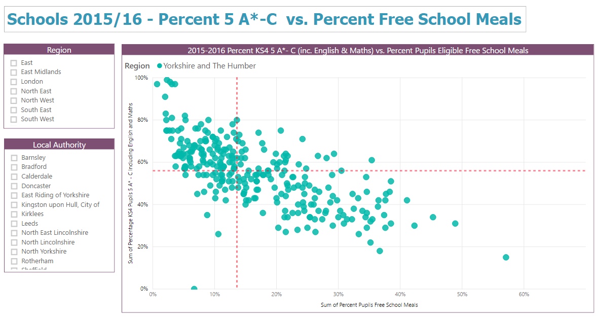
The scatter chart below is a good example. The data, downloaded from the Department for Education website, is about school performance in 2015/16. It shows the percentage of pupils getting 5 grades A* to C (including English and Maths) at each school together with the percentage of pupils at the school who get free school meals. The source spreadsheet contains a lot of other useful data about schools including location - town, local authority and region.
Power BI makes it easy to explore this kind of data and then share any insights. I do some simple tidying in MS Excel - remove columns I don’t really want, convert region codes into names - and then format the set of data as a Microsoft Excel ‘table’.
I then import the table of data into Power BI and build the report. Two slicer visualisations let you pick region and local authority. I plot percent 5 A*-C on the Y axis and percent free school meals on the X axis.
Visualising the data in Power BI is straightforward. What is harder is understanding the significance of any patterns or trends. The Analytics pane within the Visualisations panel in Power BI Desktop gives you a few useful tools to help interpret the data. I added two red dashed Median lines - they divide the scatter chart into 4 and make it easier to spot the schools that appear to get better (or worse) than average results.
There’s still more more you can do to understand significance of the relationship. The next step is to look at the correlation between the two sets of data. That gives us a measure of the degree to which the two values (% GCSE 5*-C and % free school meals) are related to each other and move together. That’s the subject of another post.
Related Posts
Power BI in schools - a student performance dashboard What's the difference between measures and calculated columns in Microsoft Power BI?
Power BI in schools - a simple way to look at student attainment
Power BI in schools - prototype dashboards with MS Excel
Visualising school performance in Microsoft Power BI
Looking for insights - Pearson Correlation and measures in Microsoft Power BI
Slicer visualization in Power BI - filtering by date with help from a simple measure