Power BI in schools - a student performance dashboard
This is one way to build a very simple Power BI report to track student assessment performance. It illustrates three things:
-
The importance of understanding relationships between tables, even in simple reports. Your Power BI model - the tables and the relationships/joins between them - is the foundation of good reports.
-
How some simple measures are needed to make the data and the report more useful.
-
Why it is important to keep the report as simple as possible - reports with lots of interactivity and multiple themes can be fun to create, but they often confuse users.
In this example we’ve got just two tables of data – both imported into Power BI Desktop from an Excel Workbook. If you’re working with data from your MIS - for example the Arbor Snowflake data warehouse - you often have to build reports that use many tables, so this simple report is a good place to start if you want to begin to understand tables and relationships in Microsoft Power BI.
Understanding tables and relationships is the key to good reports
The example has two related tables. There’s one row per student in the Students table, but multiple rows per student in the Attainment table.
After importing the data from Excel, Power BI Desktop will automatically creates a join or relationship between the two tables on StudentId:

Notice the direction of the join between the two tables. The arrow points from the Students table to the Attainment table. The join is a one-to-many relationship. Each row in the Students table is unique - there is one row for each student - but there can be multiple rows for each student in the Attainment table.
The direction of the arrow also means that by default it is the Students table that filters the Attainment table. That makes intuitive sense in our simple example - you'd want to use values from the Students table - for example student name - to filter rows in the attainment table.
The Attainment table contains not just the results of assessments (the level), but also the teacher target for the student. We use a Type column to distinguish between them:
[Type]="Current" or [Type]="Target"
In more complex reports, with more tables and more joins, you sometimes have to think carefully about how a filter on a table cascades through the other relationships. It’s beyond the scope of this example, but your Power BI model design - the tables and the joins - is the foundation of a good report; a report that is easy to design and extend.
This is what the report looks like.

There are three slicers so we can filter by Current School, Form Group and Student. Just like in one of the earlier examples, we can look at average student attainment in each subject. Remember the earlier point about the relationship and filtering direction - we’re filtering with data that comes from the Students table.
There’s a table that shows all students and includes columns for Current Attainment, Target Attainment and Current Level Variance, the difference between them.
And there is a Line & Stacked Column chart that shows both current and target attainment by subject, so you can spot differences by subject.
Simple measures to understand student attainment
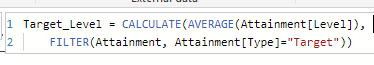
The Current Attainment Level measure looks like this:

The measure uses the Calculate function to evaluate an expression - calculating the AVERAGE attainment level - after a filter has been applied to select only the records from the Attainment table with the type = ‘Current’. In this instance, we’re doing the average because we’ve decided it’s a better, more accurate measure of a student’s performance than just taking the latest attainment level where type = ‘Current’.
The Target Attainment Level Measure is a bit more complicated. This time we’ve decided we want the latest target for each student, because it’s possible that teachers may want to adjust targets and students progress through the year.
Here’s the Target Attainment Level measure:
There are two parts to the measure. First, we create a variable called latestdate with the value of the latest Attainment[Date] where the Attainment[Type] = ‘Target’.
Then, we calculate the average attainment level for the targets that were set on our latestdate. Note - we’ve used AVERAGE, but we’re really only expecting a single target level for our latest date.
There’s an important point to note. In both measures, CALCULATE operates within the current context – but then applies an extra filter on the Attainment[“Type”] field (and latestdate in the second measure).
That means it works when added to a table of students – it will calculate the average level for each student. It will also work when used on a bar graph with subjects – it will get the average level within each subject.
A third measure, Current Level Variance, is simply the difference between the two other measures.

Conclusion - simple reports work best
There are a few reasons why I like simple reports like this:
-
A simple report is less likely to confuse users. We want users to think about the data. Nobody should struggle to understand how the report works. It is very easy with Power BI to build interactive reports that make sense to the report author, but are actually just complicated enough to confuse end users. This report does just one thing - it shows student attainment - current versus target.
-
A low testing overhead – it doesn’t take long to double check that the measures are working as expected. You can go back to the Excel source data, do some quick calculations and compare with the Power BI report.
-
The report is focused on one thing – how students are doing – but it does lead you towards some more questions that could be answered with further pages in your report. For example, do we see more under performance in certain subjects? How do different groups of students do?
Power BI in Schools
Our bespoke support and training for schools and MATs that want to leverage the full potential of Microsoft Power BI.
Related Posts
What's the difference between measures and calculated columns in Microsoft Power BI?
Visualising school performance in Microsoft Power BI
Looking for insights - Pearson Correlation and measures in Microsoft Power BI
Scatter Plots, School Performance and Microsoft Power BI
Power BI Cumulative Totals and Measures - Course Sales Pipeline
Slicer visualization in Power BI - filtering by date with help from a simple measure