Slicer visualization in Power BI - filtering by date with help from a simple measure
Here's how you can use the slicer visualization and a simple measure to filter time based data. The data is basic school attendance data.
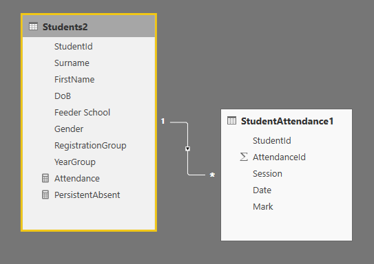
There are two tables - Students and StudentAttendance. Not surprisingly, there’s a one to many relationship between them on StudentId. Every student gets two attendance marks a day, one in the morning and one in the afternoon. ‘P’ for present, ‘U’ for unauthorised absence and ‘A’ for authorised absence.
 The key is this simple measure:
 Attendance is calculated by dividing the numbers of rows where a ‘P’ is marked (so rows when present) by the total number of rows. We use a measure because we may want to do the calculation in different contexts - we might need the overall class attendance, or attendance by year group or attendance for each student. A measure recalculates on the fly based on the filters we apply.
Notice the little trick with the ‘ + 0 ’ . The FILTER ‘StudentAttendance[Mark]=”P”’ could return no rows. COUNTROWS would then return ‘BLANK’ and that would mess up the division. The ‘+ 0’ means we get a zero, even when FILTER returns no rows.
The Slicer is neat because when we use it with a date we automatically get a slider to filter between an upper and lower limit.
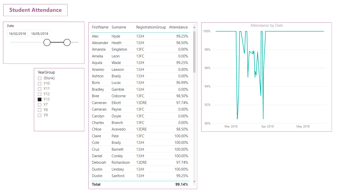 The Attendance measure works with the line chart and of course it works in a simple table - attendance is calculated for each student in the table. And we can add another slicer and filter by year group.
Measures are powerful but at first they are harder to understand. The answer is always to start simple - find one or two real world examples and begin to puzzle them out.
Related Posts
Why data analytics with Microsoft Power BI might just be great for your school
A first look at the UK HE longitudinal education outcomes dataset with Microsoft Power BI
Power BI in schools - a student performance dashboard
What's the difference between measures and calculated columns in Microsoft Power BI?