Visualising school performance in Microsoft Power BI
It’s easy to get hold of schools performance data about schools in England - data is available for download from the Department for Education website. This post uses the latest end of Key Stage data - the provisional dataset for 2016/17. You can find it here.
What’s the best way to visualise school performance data with Power BI? What is the best way to give the non expert - someone who doesn’t know too much about schools and statistics - an overview of school performance in their home town?
The dataset includes several performance measures, some easier to understand than others:
-
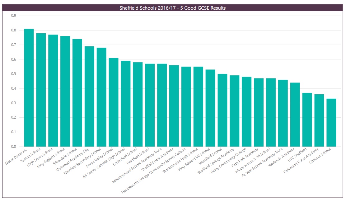
Percentage of pupils at end Key Stage 4 that get 5 or more good grades at GCSE including English & Maths
-
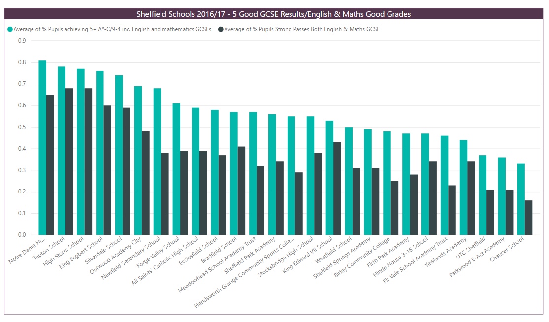
Percentage of pupils at end Key Stage 4 with good grades in both English & Maths
-
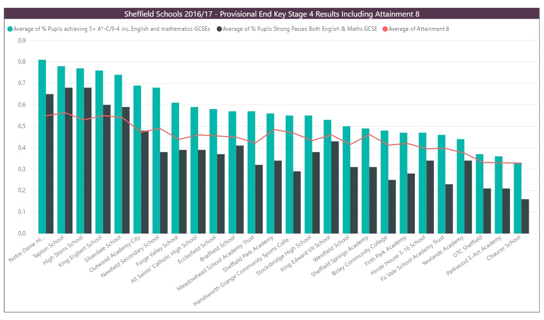
Attainment 8 average per pupil
-
Overall Progress 8 measure for the school
Let’s start with the first one. Most parents in England understand what 5 GCSE grades A* - C including English and Maths means. The obvious way to show the data is a column chart:
The second measure is similar. This time it’s just GCSE English and Maths - pupils who get good grades in both. Here’s that data added to the same bar chart. The two measures tell almost the same story - there are just a handful of schools where fewer pupils than expected get two good grades in GCSE English and Maths.
Things get more complicated with Attainment 8. Most parents probably don’t know what means. It’s a score per pupil based on 8 different subjects - one number that’s calculated by taking the pupil’s best grades across 8 different subjects and combining them into a single overall score.
I’ve added the average Attainment 8 score across all pupils for each school as a line graph on top of the two other measures - now three measures in the same chart.
It gets harder again with Progress 8. The calculation of Progress 8 is a little more complicated.
You start by taking a pupil's end of Key Stage 2 score and then from that you estimate the pupils expected end of Key Stage 4 Attainment 8 score. That estimated Attainment 8 score is the average Attainment 8 score of all pupils in the same cohort with the same prior attainment at Key Stage 2.
Then you look the pupil’s actual Attainment 8 score. Their Progress 8 score is the difference between the two, divided by 10. You’ve now got a measure of how the pupil has over or under performed against their estimated Attainment 8.
The school’s Progress 8 score is just an average of all the pupil scores - it’s an attempt to measure value add. In theory at least you should now be able to identify schools that underperform - maybe they get good results from a very able cohort but they haven’t added as much value as a school that gets less good end of Key Stage 4 results but does it with a cohort that starts from a lower base.
Here’s a chart that uses Progress 8. It’s a ‘line and stacked column’ chart. The two GCSE measures and the Attainment 8 measure (divided by 100 so we can compare more easily) are added as lines. The columns are the Progress 8 scores for each school.
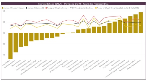
The above chart is a bit more interesting. The four schools with the best Progress 8 score - the last 4 schools at the right hand end of the chart - get less good GCSE results than the schools immediately to their left. The two good grades in GCSE English and Maths measure takes a noticeable dip. The data seems to telling us that these 4 schools are performing well - their GCSE results may not be the best in Sheffield but their Progress 8 scores suggest they are with a cohort that started from a lower base at the end of Key Stage 2.
Related Posts
What's the difference between measures and calculated columns in Microsoft Power BI?
Looking for insights - Pearson Correlation and measures in Microsoft Power BI
Scatter Plots, School Performance and Microsoft Power BI
Power BI Cumulative Totals and Measures - Course Sales Pipeline
Slicer visualization in Power BI - filtering by date with help from a simple measure