The best way to develop Microsoft Power BI reports for schools
The best Microsoft Power BI reports and dashboards are simple. They turn large sets of tabular data into user friendly, interactive visualisations that make it easier to spot data trends and other useful insights.
Simplicity really is the key. Just like with other kinds of software, users want an intuitive design that requires little or no effort to understand. Less is nearly always better.
Here are 5 things to consider when you’re building reports in Microsoft Power BI:
- Get your data into the right format. Data in spreadsheets should be formatted as a flat list. Data that comes from a database will already be in flat tables, but data in spreadsheets can sometimes need ‘unpivoting’ before you do the import into Power BI Desktop.
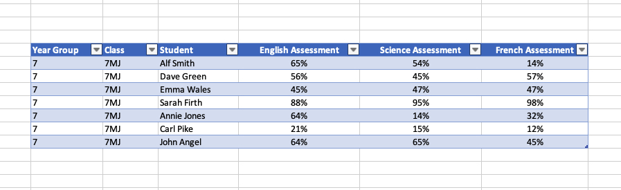
This is an example of data that needs unpivoting:
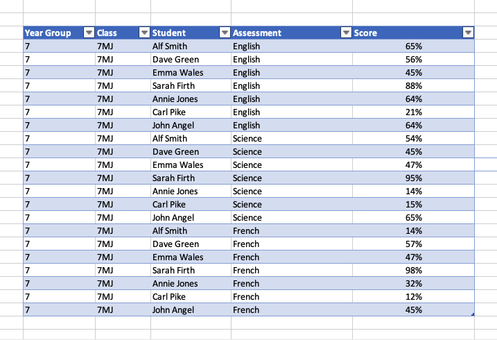
 You want the data to look like this before you import it into Power BI Desktop:
The good news if you're working with big tables that need unpivoting is that newer versions of MS Excel will unpivot data for you. Do a Google search for 'How to unpivot data in Excel with Power Query'.
- Create a basic report template. Use your school’s logo and colours - a little bit of styling goes a long way.
Create a new page in your report and add some custom headers and footers. Put the logo at the top left and leave a space at the top right for the report title.
Copy that new empty ‘template’ onto another new page in the report - copy it each time you want to add a new page to the report.
- Whenever you can, aim to answer one question or provide one big insight on each page of your report. You can actually make the title of each page of your report a question.
The one question per page of your report rule is a hard rule to follow, but if you can do it, you will get a better, more accessible report.
One thing that does make it easier is understanding your audience - what insights would really help them? It’s very easy to build a report - connect to data, add some visualisations - without really thinking about how the people who see the report will spot any real value.
- This is a golden rule. Don’t over complicate. Resist the temptation to add too many visualisations on each page of your report. The point of the exercise is to simplify data and make it easier to spot useful insights.
Remember point #3 and try to answer a question on each page of your report.
- Use a simple left to right layout. People read from left to right and I think the same applies to reports. Plus, people are used to seeing website navigation elements on the left (or top) of the screen.
You can do the same with your reports - your user will understand that the filters and slicers on the left will change what appears in the charts and table visualisations on the right. A one quarter/three quarters left-right split is a good rule of thumb.
Put filters and slicers on the left. Put bigger charts and tables on the right.
Power BI in Schools
Our bespoke support and training for schools and MATs that want to leverage the full potential of Microsoft Power BI.
Does your school use the online Power BI service? When you’re done, you want to upload your report directly from Power BI Desktop into the online Power BI service, then you can share reports with colleagues.
Related Posts
What's the difference between measures and calculated columns in Microsoft Power BI?
Visualising school performance in Microsoft Power BI
Looking for insights - Pearson Correlation and measures in Microsoft Power BI
Scatter Plots, School Performance and Microsoft Power BI
Power BI Cumulative Totals and Measures - Course Sales Pipeline
Slicer visualization in Power BI - filtering by date with help from a simple measure