Build a simple interactive school student satisfaction survey report with Microsoft Power BI
Power BI is a great tool for visualising data and finding useful insights, particularly when you use it to then share your insights with colleagues and other stakeholders.
This student satisfaction report is an example of an interactive report built on top of some very simple data in MS Excel. The report illustrates a couple of fundamental lessons:
-
The format and accuracy of the underlying data is important - get that right first.
-
Think about your audience and keep the report simple - less is nearly always better.
The goal with this report was to create something interactive (and engaging) that non-technical stakeholders could use to explore student satisfaction data. That’s important - we are not trying to develop a super flexible, complicated reporting tool, but instead we want to use interactivity to engage non-technical stakeholders with data about student satisfaction.
Let’s look at how the report was developed.
Step 1 - Find some survey questions and associated responses. You could write them, but for this example I decided to use Ofsted’s student satisfaction survey - the one they ask students to complete during a school inspection.
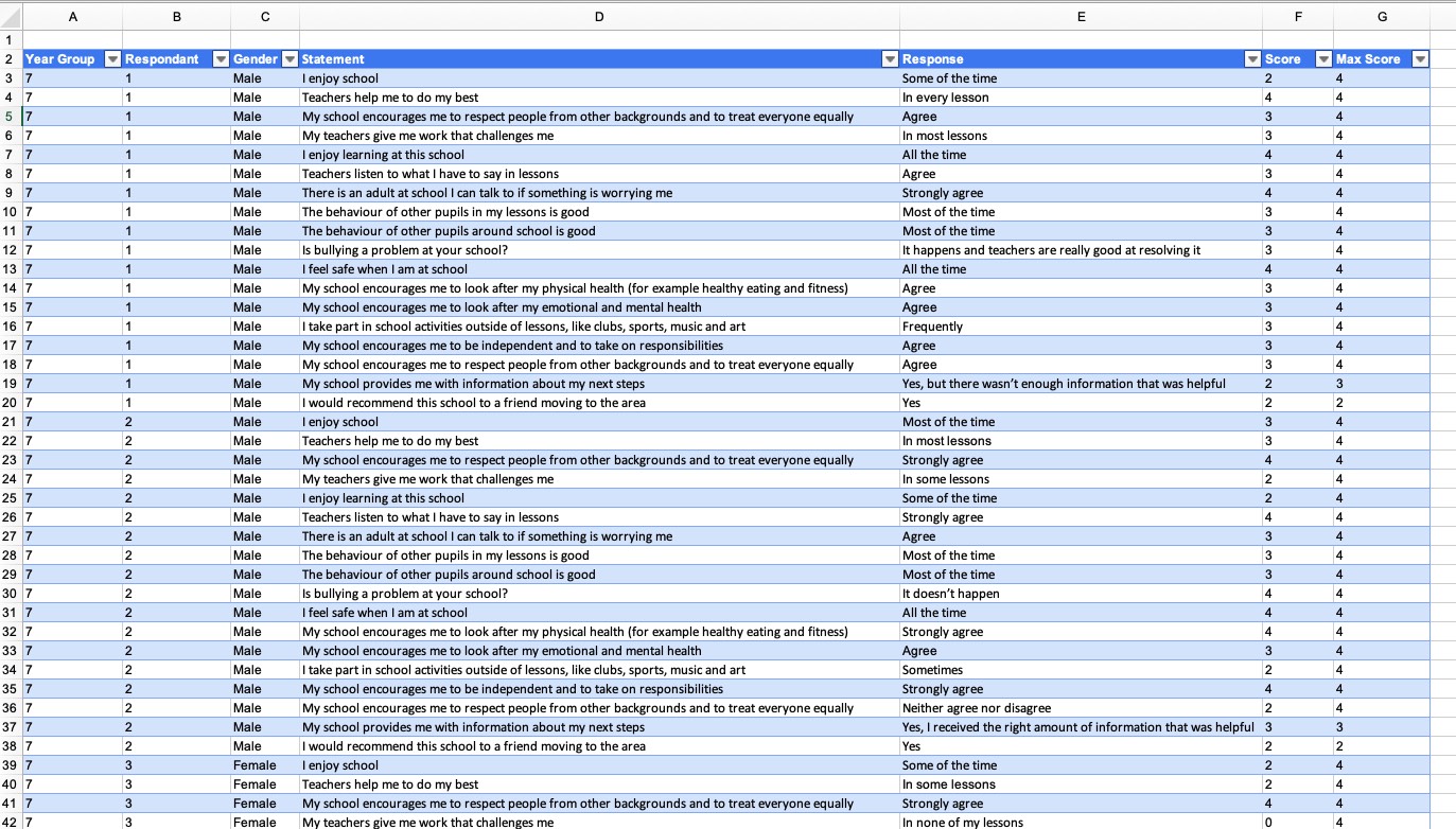
Step 2 - Create some dummy data (unless you’ve already got some real responses). Creating the data is easy enough - it just takes time. I created over 800 rows in Excel (mostly by copy and paste). That represented responses from 48 pretend students to the 18 survey questions/statements in the Ofsted survey.
Below is a screenshot of my dummy data. Some things are worth noting:
-
It’s a single flat table - all the headings are in the first row.
-
Each response gets a score. There’s a max score for each statement/question.
-
The data’s formatted as an Excel ‘table’. That’s important - do that before you import your Excel file into Power BI.
Step 3 - Import your data into Power BI. Remember, the data in Excel is formatted as a ‘table’. I called the table ‘survey_data’ when I created it in Excel. You get to select the table during the import.
Step 4 - Add a calculated column called ‘Satisfaction’. This is the only real extra bit of work you need to do before adding visualisations to your report. It gives you % score for each statement based on the responses chosen by the students. You’re converting Score to a percent of the Max Score.
Satisfaction = (survey_data[Score]/survey_data[Max Score]) * 100.
This calculated column is used on the clustered bar chart visual.
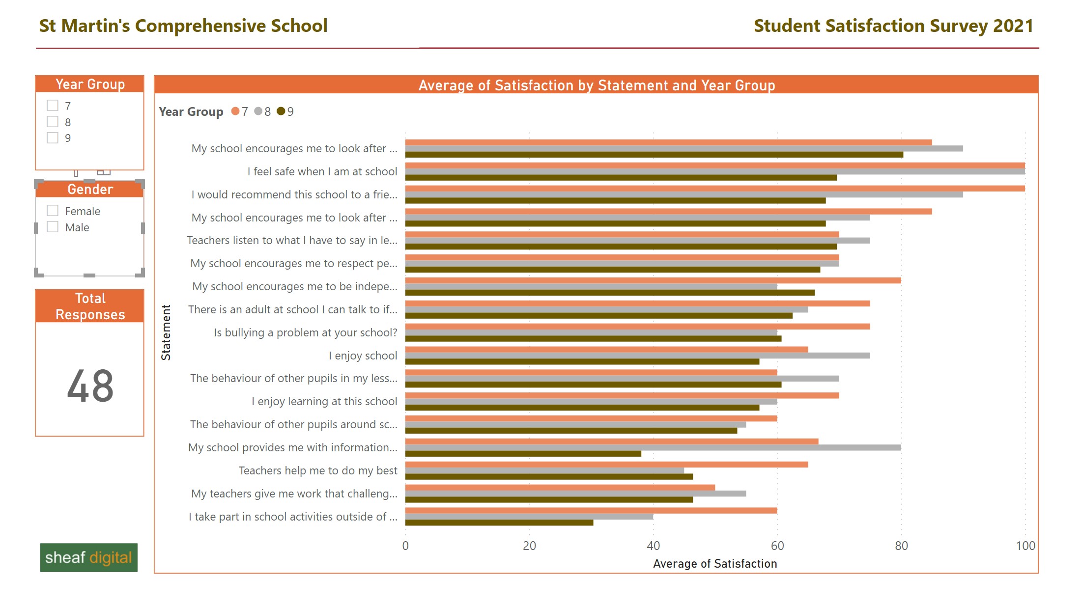
Step 5 - Build your report.
This is a simple report. It uses just 4 visualisations.
-
2 slicers - so you can filter on Year Group and Gender.
-
A simple card - displays the total number of responses.
-
A clustered bar chart. I chose this because you can compare responses across the three year groups. You get a column per response for each year group.
It’s worth mentioning again the points I made at the start. The two important things to keep in mind are:
-
The quality & format of your source data. A lot of the real work is in data cleansing & preparation.
-
Your audience. Who’s the report for? My experience is that schools (actually not just schools) and their users want simplicity. Power BI gives you lots of options and it can be tempting to add features/complexity to your reports, but that often doesn’t make sense. Schools collect a massive amount of data and Power BI’s value is that it gets you to think about how you manage that data and then tease out the genuinely useful insights that are worth sharing with colleagues. You have to work hard to keep things simple.
Finally, don’t forget the online Power BI service. I developed the report in Power BI Desktop. The next step would be to upload it into your school or MAT’s Power BI service. Then you can share it with colleagues and other stakeholders.
Power BI in Schools
Our bespoke support and training for schools and MATs that want to leverage the full potential of Microsoft Power BI.
Related Posts
Why data analytics with Microsoft Power BI might just be great for your school
A first look at the UK HE longitudinal education outcomes dataset with Microsoft Power BI