Blog
All Posts
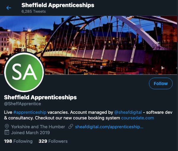
Sheffield Apprenticeships - local branding, open data and fast software development
Online Course Marketing Ideas - Reach more learners - 5 simple ideas that work
Here are some simple things you can do to build a bigger online audience, promote your courses and increase bookings/enrolments. They are not complicated and most are based on things we can learn from successful sites like Amazon or YouTube.
Online Learning Technology Guide - how to deliver affordable online training
How do you create good quality online training, particularly if you want to do it quickly and you’re on a tight budget?
Here are 5 different approaches - the approach you choose will depend on your own circumstances and requirements. These should give you an idea of what’s available and encourage you to think a bit more about your long term goals for your online training offer.
Coursedate - online course bookings and CRM for training providers
Coursedate is designed for training companies, CPD providers, language schools and other organisations that want to promote courses online, find more learners and streamline the admin around course enrolments. It’s a great solution for any busy training or education provider that needs to move away from spreadsheet based course management towards a more scalable, future-proofed alternative.
Sheffield Apprenticeships - How to develop an app for Android and iOS with React Native
The Sheffield Apprenticeships app is the quickest way to find apprenticeship vacancies in Sheffield. You scroll through a list, click on a vacancy and then if you’re still interested, go directly to the Gov.uk Find An Apprenticeship website and apply. The app does exactly what Apple recommend in their app developer guidelines and solves a problem; young people can see at a glance the apprenticeship opportunities in Sheffield.
How to create a better website landing page so you get more leads
What makes a good landing page for an online service or application? I decided to look at the home pages of three successful online services and pick out the things that seem to represent good practice.
Online learning platform ideas - 5 lessons from Duolingo
Duolingo is an app (and website) for learning languages. It’s popular, easy to use and can be a source of ideas for any organisation that is thinking about creating an online learning platform and putting training online.
Learning in Duolingo is personalised - the app delivers small chunks of language training that are carefully matched to a learner’s current level of understanding. Lessons are short and there are a lot of quick tests/questions. A learner in Duolingo gets regular feedback and you don’t unlock the higher levels until you’ve cracked the earlier lessons.
How to become a software developer without a degree in computer science
You don’t need a degree in computer science to become a software developer. You just need a plan, some effort and an aptitude for solving problems. The demand for software developers is as high as ever and good developers are in short supply - that means great salaries and plenty of vacancies. You can make the move if you really want to.
Sheffield Apprenticeships - Using TwitterOAuth to post Tweets to the Twitter API
Our Sheffield Apprenticeship Twitter account (@SheffApprentice) uses the Twitter API to automatically Tweet out information about apprenticeship vacancies in Sheffield. The Tweets are scheduled - 6 individual apprenticeship vacancy Tweets and two summary Tweets every day.
Using the Twitter API is straightforward. You create your Twitter account, sign-up on the Twitter developer portal and then create your Twitter app. Creating the Twitter app generates your authentication tokens. That whole process takes just a few minutes.
Learning management systems and VLEs for schools - Part 1
The learning management system market is hard to navigate. There are hundreds of different systems and it’s difficult to make a choice when so many have similar functionality.
It must be easier to find a learning management system/VLE for a school. Schools are a niche and most will want something that has less rather than more functionality - ease of use will be a key school requirement.
SaaS pricing - what about a freemium pricing model?
I wondered a bit more about freemium pricing models after writing the last post. Freemium is where part of your software as a service is offered for free. Users sign up, they use the application for free but then have to pay for more premium features.
Hubstaff looks fairly typical. They have a free first tier. You sign up, use the free service and then upgrade to one of the paid-for tiers.