How to use Data Dashboards in Schools to Improve Student Attendance
Good decisions start with good data and even a simple dashboard can tell you a lot about patterns in attendance, trends over time and how different schools and groups of students within schools compare to each other.
The questions you might ask include:
-
How do SEN students compare to non-SEN students in different schools in our MAT?
-
Do PP students in one school have lower absence rates than the equivalent group of students in another school?
-
Which students do we need to target with extra support if we want to improve overall attendance?
Attendance data isn't complex and a good dashboard isn't difficult to build - but you have to be able to get the data. Ideally, what you want is data that is as close to real-time as possible and that normally means you need a connection to a data warehouse that contains data from your MIS. Typically that data is updated overnight.
A simple data model is best
Start with the foundation - your underlying data model is the key to building a useful dashboard. You need to decide what tables to import from your MIS data warehouse. This picture below is a simple attendance data model in Power BI. With a data model like that - just 3 data tables imported from a MIS data warehouse togther with a calculated calendar table - you can build super useful reports and dashboards. All the examples screenshots in this blog post can be built on top of that three table data model.

Design data dashboards to answer questions
What follows are some pages from various Power BI attendance reports. They all provide answers to the kind of questions asked by anyone who is trying to improve student attendance, either in an individual school or across the schools in a MAT.
An overview page is a good place to start. In this example, a MAT can see attendance rates in different schools. Some things to note about this page:
-
The slicers - used to filter data - are down the left hand side.
-
The matrix visual shows headline attendance and absence figures for each school.
-
The line chart is really important - a lot of people start by looking at the line chart. And of course, a line chart is the best way to show trends over time.
-
The cards down the right hand side show MAT level figures - useful if you want to compare an individual school with the overall MAT figure.
How can you use this page to improve attendance? There’s a lot you can do with it. You can look in detail at different year groups, filter school and analyse attendance and absence data for different groups - free school meals, pupil premium, SEN etc. The interactivity is intuitive and - this is important - the matrix (looks like a table) has only 5 columns of numbers; large multi-column tables are often harder to interpret and not always necessary.

Understand student demographics and attendance
Another way to use a dashboard to improve attendance is to look in detail at different groups of students. That’s even more useful in a MAT because you might be able to spot differences between schools - are interventions working in some schools better than in others?
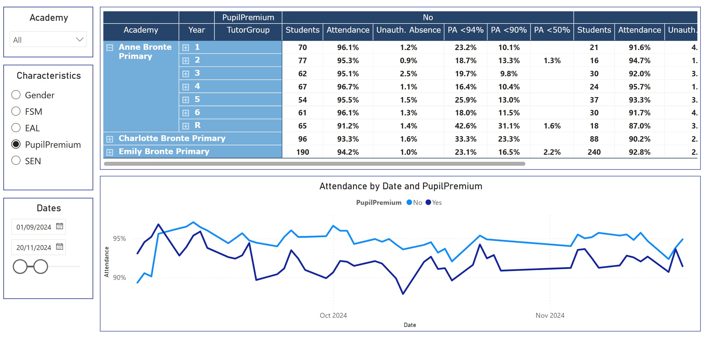
This page below makes it easy to compare SEN & PP students with non-SEN and non-PP students. And you can compare the school figures to the overall MAT averages.
Maybe, one school seems to be closing the attendance gap between SEN and non-SEN students? That school might have lessons, approaches and strategies that can be applied to other schools. It’s that kind of actionable insight that you can get from a simple, well designed data dashboard.

Here’s another dashboard that provides insights into attendance rates amongst different groups of students. The Characteristics slicer on the left allows you to filter the data displayed - you get to see a detailed attendance breakdown for the different demographics and you can see the change over time.
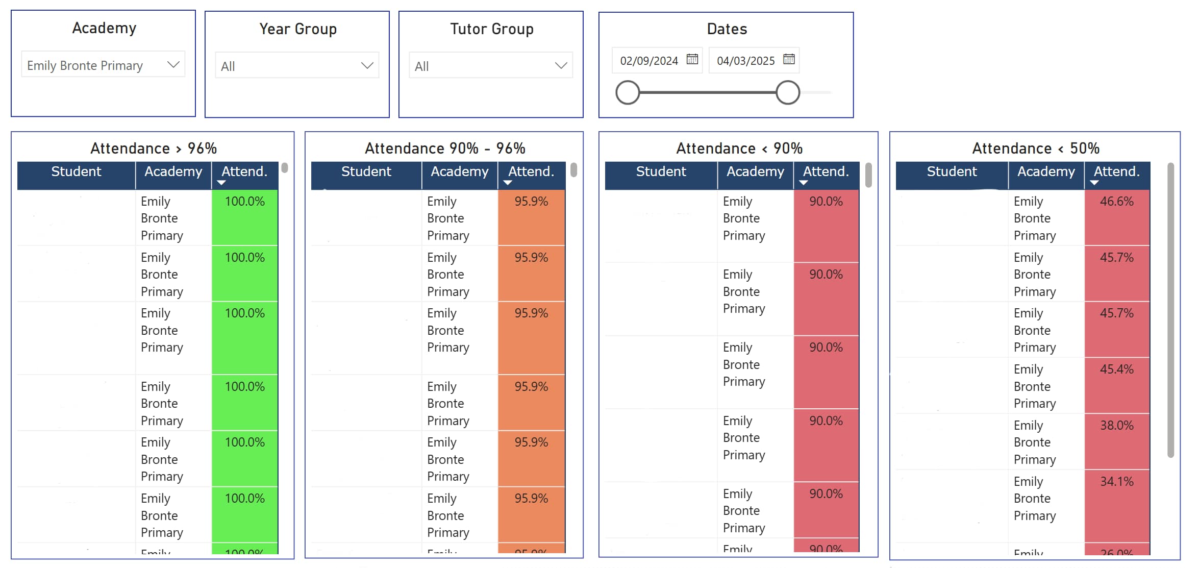
Use student level data to target support
Our data model - the four linked tables - also contains individual student level data. We can drill into schools, year groups and tutor groups and then find the students who have high rates of absence. And we can use conditional formatting in Power BI to create RAG - red, amber, green - style pages.

To make it even easier to spot the students who may need extra support - or the students who get positive feedback for good attendance - we can create separate tables to show students who fall below different attendance thresholds. Persistent absence and serious absence becomes easier to spot with this kind of dashboard.
Conclusion
The future of school improvement is data-informed. A simple, well-connected dashboard gives you the visibility to lead with confidence - across schools, across different groups of students and over time. And you get a shift in culture. When teachers and senior staff see meaningful, timely data, they start asking better questions - and then they take quicker action. It’s not just about what the data says.
School Data Dashboards
Interactive data dashboards that can be shared with colleagues and other school stakeholders.
School data management solutions that simplify data analysis and reporting.